If someone asked me the question “what’s your most satisfying gaming experience?” I would certainly answer Deus Ex Human Revolution. There are a lot of components that go into making a game pleasant: the art style, the musical atmosphere, the story, but what truly “makes or breaks” a game is the gameplay experience. “What does the player do on a moment-to-moment basis and how is he compelled to do those things?” are two questions I always ask myself while designing or analyzing a game. In the case of DE:HR, I simply thought I’d share how I think the game “compels” the player into going somewhere or doing something. Why is that worth sharing? I think this shows what can come out of a strong bond between art and design and how it can enhance the player’s experience.
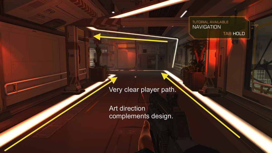
IMAGE 1
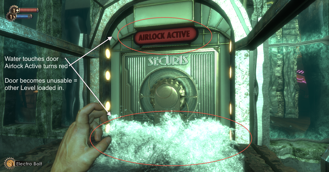
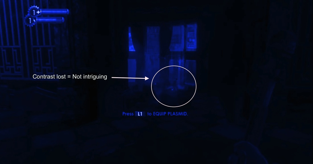
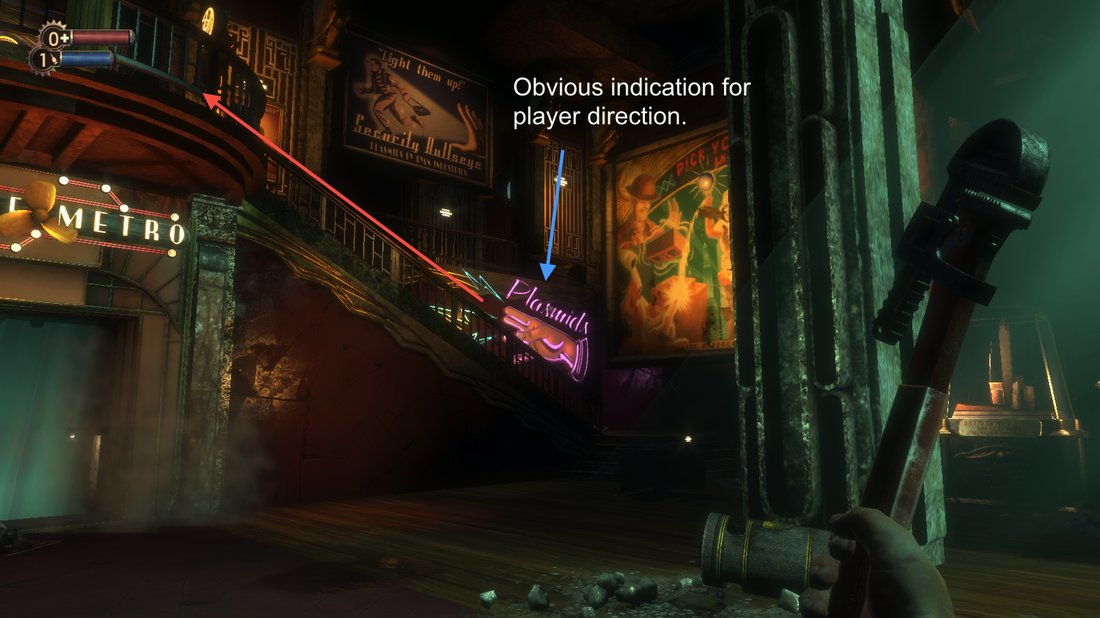
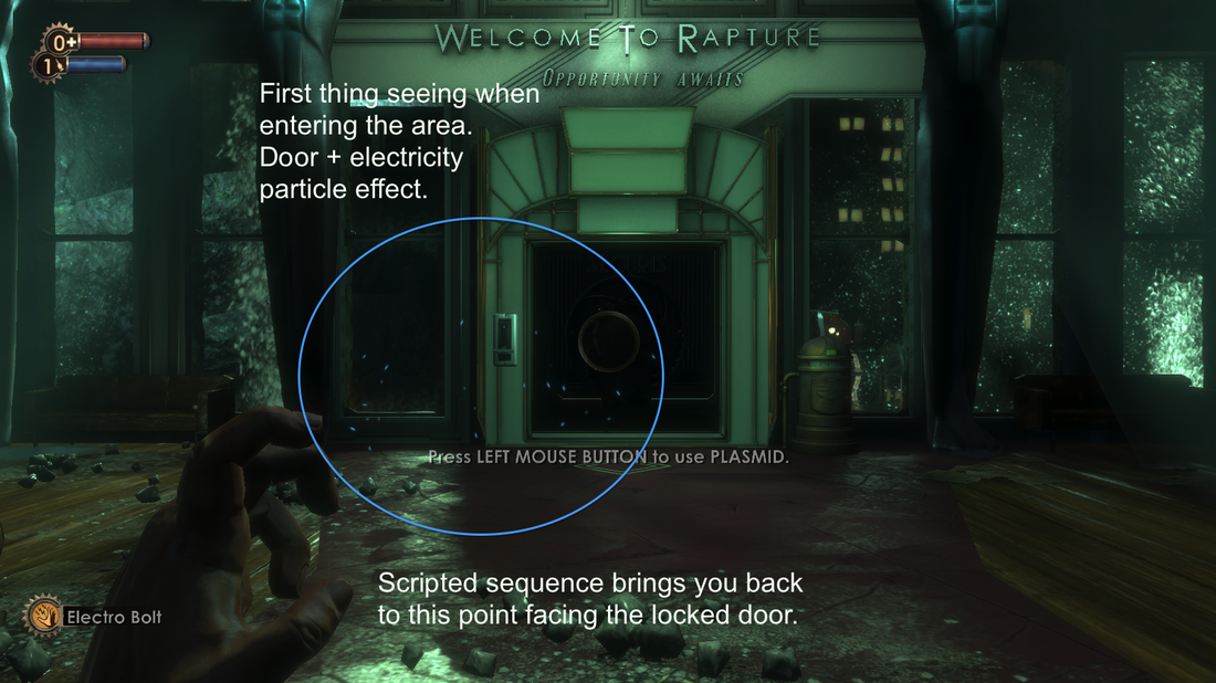
What I want to highlight in the first few images is how the game's environment really pushes you in the right directions and informs you in a very clear manner what is the main path to follow. As I mentioned in the first level analysis post on Bioshock, it is best when starting out a game to keep the level of frustration or difficulty very low in order to easily reward the player, bring him satisfaction and possibly keep him playing. In the first picture, and pretty much every other one, we see the use of distinct straight lines supported by a very bright emissive material.
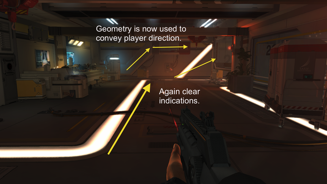
IMAGE 2
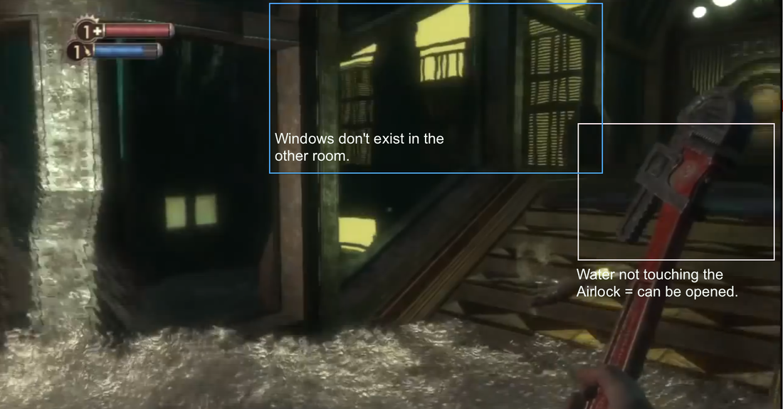
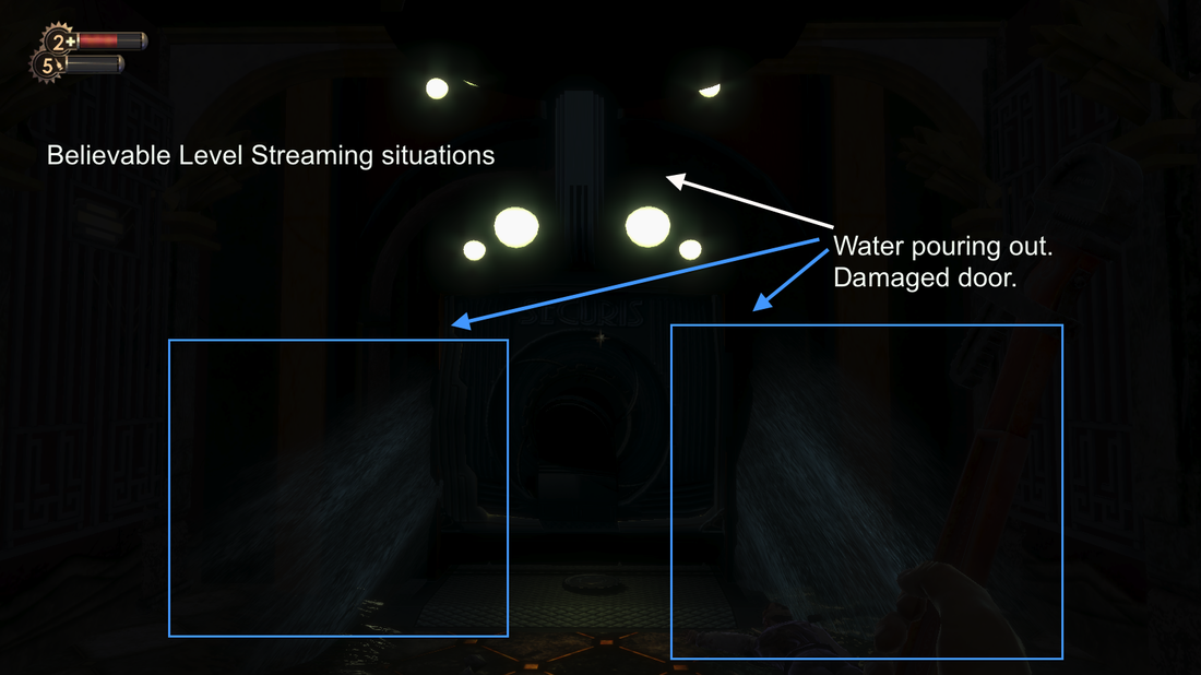
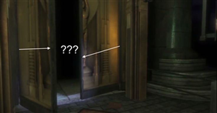
This is not put in place simply for aesthetic purposes, but also to define a player path. A wide variety of theories try to justify why bright shiny things naturally attract people, I’ll just take in consideration that it’s an innate thing. The bright lines make it easy for the player to notice them and follow them since they simply stand out. You’ll see in image 1, 2 and 5 that a line will often be found to be pointing in the direction of the “the main path” (found on walls and ceilings).
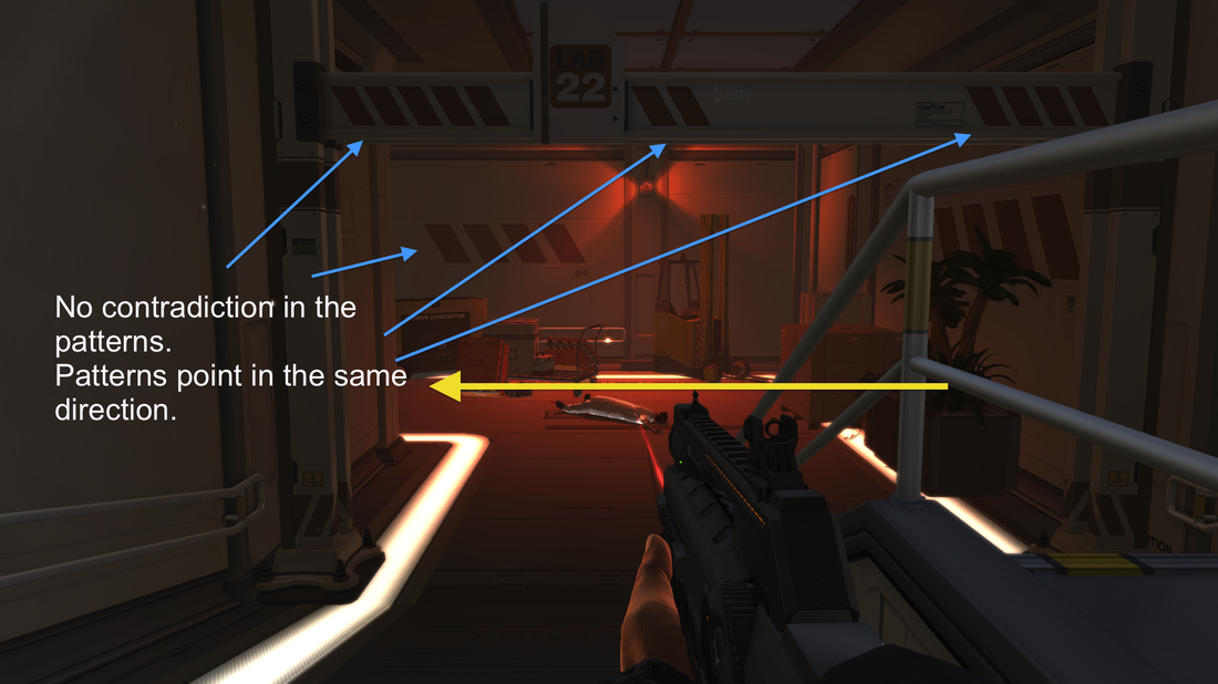
IMAGE 3
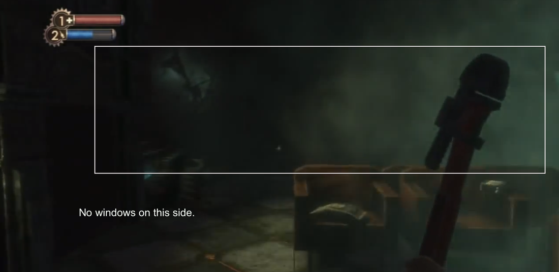
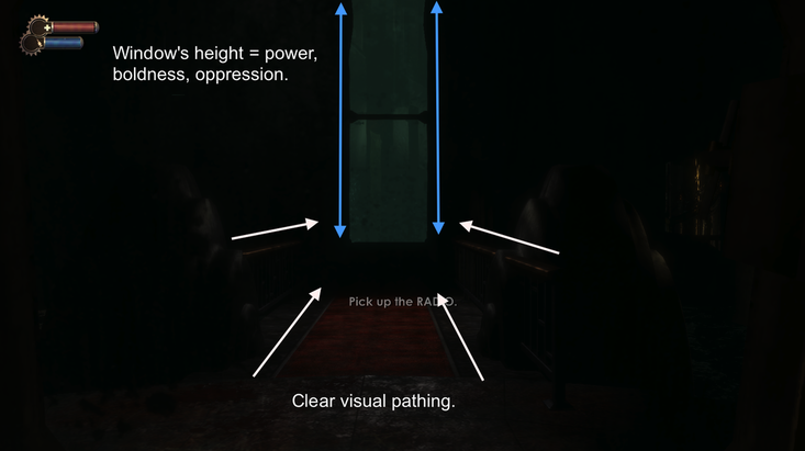
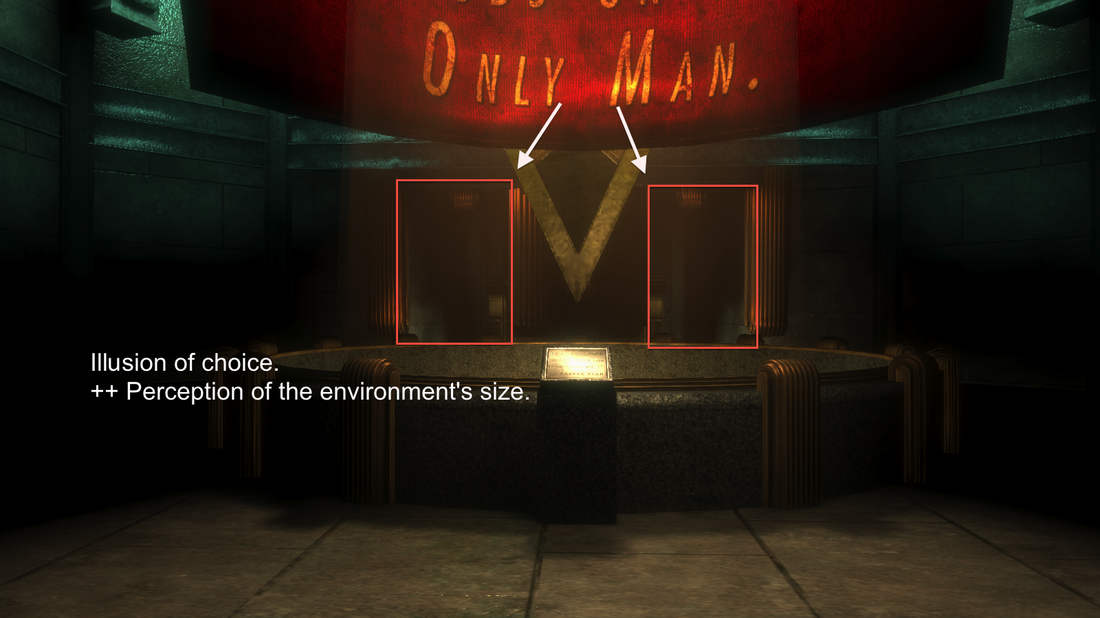
As the player progresses other techniques are introduced such as the use of geometry to reinforce this sense of direction (image 4). The materials themselves (can also use decals for quicker iteration) have direction information as demonstrated in image 3. You’ll notice that none of the patterns contradicts themselves. No pattern is reversed or put in a different orientation. This would simply be incorrect in terms of aesthetic, but also in terms of design where we want to make things clear .
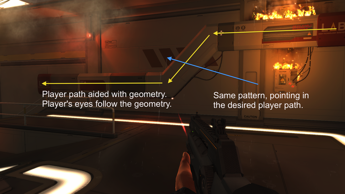
IMAGE 4
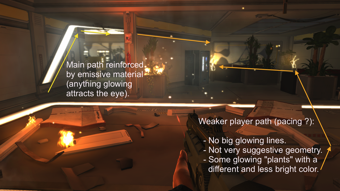
IMAGE 5
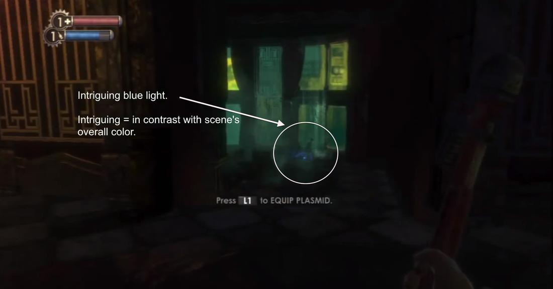
I think that’s always why I thought DE:HR had a nice level flow. Its environments are very suggestive and use the right techniques to bring the player from point A to point B. Every “player path enhancer” don’t feel out of place either, they feel like they’re a part of the environment which can sometimes be a true challenge while designing any game. I think this is the result of great communication between art and design.
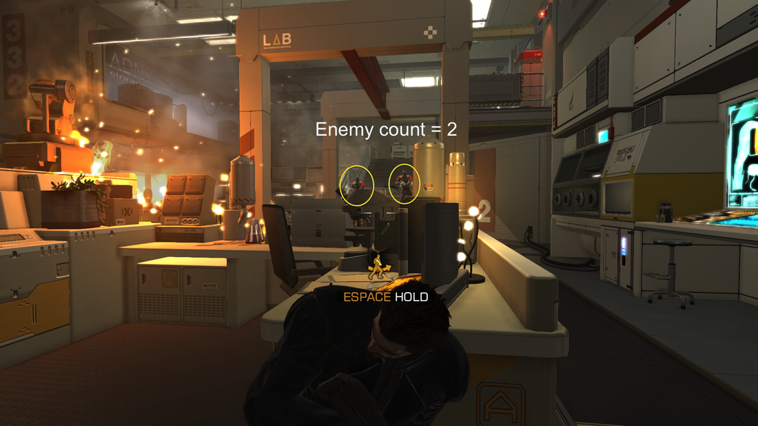
IMAGE 6
Another thing that I couldn’t help but noticing is the way the game gradually teaches the player the complexity of stealth encounters. It starts by introducing two enemies to the player and increments by one enemy each time a new “encounter room is reached” (see image 6 through 8). It’s one of those patterns that I often see while playing the first few minutes of stealth-oriented game.
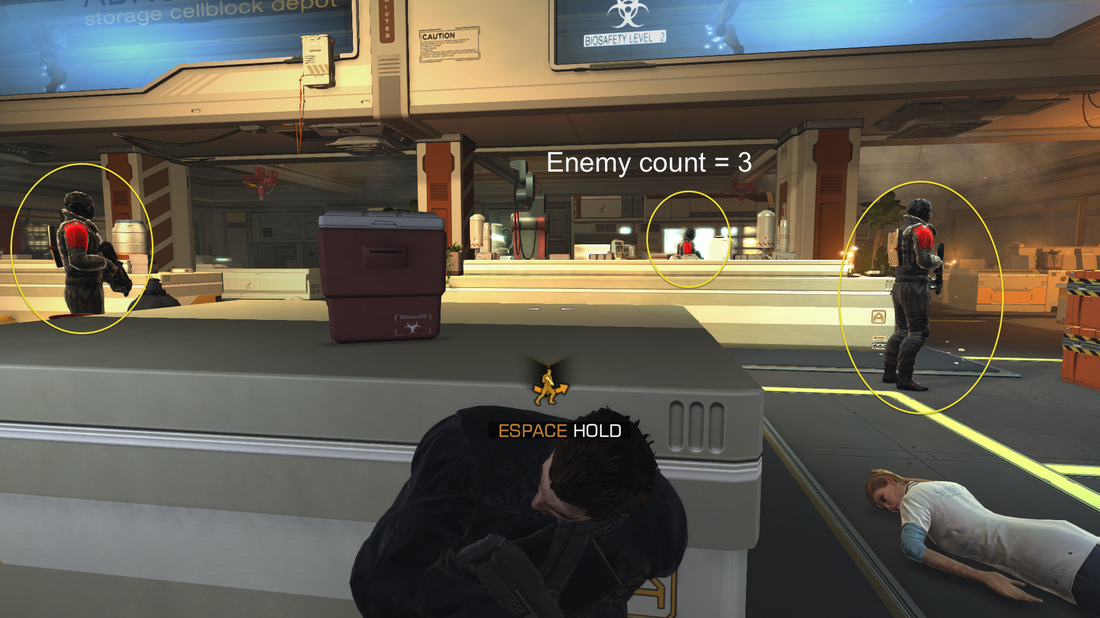
IMAGE 7
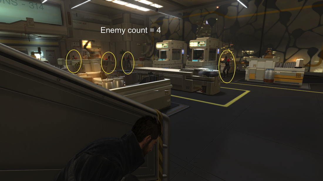
IMAGE 8
 RSS Feed
